Tuesday, July 3, 2007

Haute Couture FW07 I

It's the week of the tres grand and fabulous again! Ever since reading The Beautiful Fall, I now really see take haute couture a bit more seriously, although I still think it a bit as a historical art form.
Christian Dior
60th Anniversary! It sounds like we're always throwing events like anniversaries more as pr events than actual meaningful events, but this is Christian Dior. A lot of super/ big models walked for the show, including Gisele, Linda, Helena, Raquel etc. And this is probably one of those shows which looking at the photos (like we are now) is very different from actually being there. The show was held in Versailles -can you imagine how amazing and wonderland feel the show must have been?
Think back to the New Look, one of the looks that revolutionised fashion. OK, the outfit Gisele has on isn't exactly the same as the New Look... And I really like the pink swirl in the middle of the dress. Unlike the typical rose (which lots of other designers like putting in the middle of their dresses,) this swirl is like a blob of paint on a painter's palette.
These two dresses are so glam, etheral and pretty without being overly puffy or exagerated.
I love the outfit Irina's wearing on the right. It's just so pretty and haute-casual (if that makes any sense.)
Dior's super grand dresses.
And even more. I think these dresses are so amazing (think of all the work put into one dress,) but somehow these huge dresses don't seem to connect together as they usually do. Maybe the variety was too large?
These two dresses-fierce!
The dress Lily Cole has on here is probably the one that really caught my eye. I don't know if it's the dress or the shimmery purple eye makeup Lily has on, or the way the different shades of purple seem to create contrast at the perfect areas, but the whole image is just SO captivating. Loves this image!
And if you still can't get the message, the collection was influenced by various painters. OK, I have to admit, I don't think this show was perfect. To me, the SS07 show and collection seemed more perfect and amazing. But still, happy anniversary to Dior!
Ann Valerie Hash
The clothes seem casual and trend-influenced, but it's still worth taking a look at them. The message? White, black and bold colours all the way!
Photo credit: www.style.com

Geeks and Nerds and Dorks, oh my!

The sad thing about most of the tattoos in this blog is that they could be so awesome if the tattooer and tattooee (is that even a word?!) just had a little more sense. Or skill. Or both. Nerd tattoos definitely fit into this category. I am all about awesome tributes to dorky things and there are so many amazing nerdy tattoos out there (see the last entry of "good as in bad" tattoos for proof). However, it's very easy to miss the mark. And unfortunately the following people missed it by a mile.

This tattoo comes with an explanation (because seriously, there is no way anyone would get it, even if they do recognize fractals). It looks like blobs from outer space that are bleeding out into the skin.
"This is a piece of the Mandelbrot Set, the most recognizable (and first?) fractal. It uses the quadratic recurrence equation: Zn+1 = ((Zn)(Zn))+C"


Here are a couple people who decided that, instead of illustrating their nerdiness by getting an awesome tattoo of something they really love, they would just get the word. Because tattoos of words always look cooler than pictures, right? Wrong. Especially when they're done this badly.


And finally, here are a couple tattoos that aren't done badly, and aren't even horrible ideas, they're just placed and sized horribly. Both of them would be pretty cool if they were smaller and on an arm or a leg, but taking up that much prime space with something so simple and blocky just makes me cringe.

Also, it was pointed out to me that having LVL UP and a half-full EXP bar makes zero sense. The bar should be totally full or totally empty.


And finally, here's one that I found that I actually like. I think it's a cute combination of traditional tattoo design and nerdy content.

Bad as in Good

After all this trash talking, I thought I'd give you guys a break and prove that tattoos can indeed be totally awesome and rad and amazing. Sometimes "bad" is slang for "good", so this category is "Bad as in Good" and is here to give your eyes a rest every once in a while.

Penguin looks like Penguin and not overly zombified. This is a hard line to walk, but they got it!


This tattoo blew my mind the first time I saw it. I want it. I am so jealous.


Alex Ross Superman. This is so amazing.


sdf,jhsdfkjhsdkfhskj this dude! It's so cool that I am speechless.

Kurt Halsey fan tattoos

I think Kurt Halsey's drawings are unbearably twee and obnoxious, but I can see the appeal among the young and twee crowd. I knew there were people out there with tattoos based on his drawings but I had no idea there were so many! I figured most of them would be innocent little birds like the following (which is so cute it makes me want to puke, but I can understand it) :


But noooo. A ton of people went next level and got the little drawings with the little sayings about puppy love. How many of these people got matching tattoos at age 18 with their first boyfriend or girlfriend? A lot, I bet (I know for a fact a lot of the following are matching tattoos, but the first love thing is just conjecture). And that is kind of sad, because although I am by no means old or bitter, I am old enough and bitter enough to know that matching cutesy Kurt Halsey tattoos are a terrible, horrible, awful idea, and will almost surely be regretted a few years down the line.

The following are so gross and cutesy I can't even comment on them individually. The first one isn't even that well tattooed, but the rest are technically fine. It's just th idea that is so bad. Keep in mind that this is a small sampling of the inordinate amount of Kurt Halsey tattoos that are out there.


Monday, July 2, 2007

Guitar Heroes

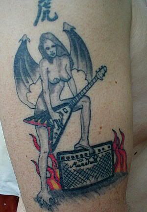
If I have to see another badly done flaming guitar tattoo in my google searches, I will shoot myself. I could have posted a billion of them, but I decided to give you guys the most creatively awful guitar tattoos instead.

Here is a skeleton playing guitar. I like the infected face, X's over the nipples, and dreadlocks.


This one isn't executed so badly. The idea could even have worked if the guy had decided on either tribal or "classic", but the font and the guitar and the tribal bits just don't work together at all.


Okay I really can't tell you why I am so annoyed about this Celtic knot guitar tattoo, but I am. Can someone back me up and agree that it's bad? It's not tattooed badly, and I guess the idea isn't even all that terrible either, it just bugs me for some reason.


Here is a NSFW guitar tattoo that almost falls into the so-terrible-and-metal-it-rules category:
click here to see the NSFW guitar

This wouldn't be so bad if it wasn't for the blank space around the signature that just makes the whole thing look messy and unfinished.


And finally, here's another amazing back piece for you guys. It comes with an explanation from the owner (all misspellings theirs):
"Tatoo includes rainbow with seasons, angel with cheerleading megaphone, guitar with wings, hard to tell with picture but also has seashells, sandles, celtc cross, trumpet with halo, birthday cake with lit candles, snow flakes, fireworks, and thanksgiving scene plus other seasons!"

Crocs

Lately walking on the streets, I've seen an uncomfortable amount of people wearing these:

Yes, by "these," I mean Crocs. There is even a whole colorful store in the best shopping district in Hong Kong devoted to the distribution of these Crocs.
I know that Bush has been seen sporting these recently, but he's hardly the icon of fashion and trends now. So WHY would the general population be seen in public wearing these, when they are not boating or doing outdoorsy things as they were originally designed for? They are certainly not flattering no matter what angle you're looking from.

But according to the Crocs site, these are the reasons why:
  1. Really soft, super comfortable, molds to your feet: well people are certainly not wearing them because they look good

  2. Barely there, weighing only 6 ounces: flip flops are barely there either...

  3. Vented so air passes through, keeping feet cool: again, so are flip flops

  4. Non-marking slip-resistant soles: a valid point

  5. Bacteria and odor resistant: thats certainly a plus seeing as how it looks plastic

  6. Ultra-hip Italian styling: It may possibly be Italian styling, but ultra hip?

  7. Port holes allow water and sand to pass through: and thats a good point because?

  8. Can be sterilized in water and bleach: well if it allows water and sand through, it'll obviously allow water and bleach through.....

  9. Easy maintenance, just wipe clean: it does look plastic...

  10. Orthotic molded foot bed for ultimate comfort and support: Is this the same as #1?

Basically, comfort, support and practicality are their selling points. So unless you are boating and doing outdoorsy things in which case these shoes may be practical, please, do NOT wear them around in public. There are just as comfortable and more easy on the eye options out there, like flats, sneakers, flip flops and *gasp* (even) birkenstocks!

Photo Credits: Crocs

Zombies

Good morning, readers!
This weekend I saw an amazingly terrible tattoo that I just have to tell you about. I didn't have a camera on me so I couldn't take a picture, but I wish I had. I couldn't decipher the whole thing, but it was a line of text running all the way across a woman's back, and it said:
(something) (something) BITCHEZ NIGGAZ (something) (something).
I wish I knew what the other four words were, but they were covered up by tank top straps and the tattoo was so badly done that the text wasn't clear at all.
Anyway, if anyone in NYC has seen this tattoo before, or has any insight into what it might say, please let me know!

This morning's theme is ZOMBIES. Zombies are awesome and I love them, but rotting flesh could possibly be one of the hardest things to tattoo.
This one goes out to Joshua.

I know zombies are supposed to look wonky and ugly, but this one just looks bad. Especially the hair.


Guy getting grabbed by a zombie, everything looking totally out of whack


At first glance this doesn't look so terrible, but then look at the eyes and how off they are.


Dawn Of The Dead tattoo. Ugh.


Then, there are the Night Of The Living Dead tattoos. I could post waaaay more bad ones (and a couple good ones), but here are a few variations on the same theme.


Cenat Cenut Blog